

Branding / UX Design Case Study
NestAir: Welcome to family friendly skies.
NestAir began as a branding exploration and passion project many years ago inspired by my big family with the sole purpose of creating a better travel experience for all families.
The solution is a dedicated family line at security check in, providing families with additional help for bulky items such as strollers and carseats. NestAir also provides family focused amenities such as a kid friendly lounge and mother’s room that all feature family restrooms taking the worry out of the unavoidable question “who’s staying with the luggage?” This service is partnered with a reservation app that gives families the option to select their ideal check in times, helping parents and check-in staff better manage their time and communicate delays effectively.
Roles
User Research
UX/UI Design
Brand Design
Deliverable Links
Feature Comparison Matrix
User Flow
Prototype

Defining the problem

How might we
improve the airport travel experience
for families?
With such a broad scope of touch points, I created a research plan that focused on five potential problem spaces for families:
1
Booking process and planning including travel guidelines for lap infants to international travel vaccines requirements.
2
Terminal amenities and access.
3
In-flight experience.
4
Food considerations for children pre-boarding, during and after the flight.
5
Special circumstances - additional needs and considerations for traveling with a newborn or special needs child.
Research goals / Q&A
“What drives parents’ decisions when booking travel?
What are some of the struggles of booking travel for children?
What kinds of issues do they experience before, during and after flying with their family?”
User Research / Key Findings
Understanding user goals and pain points
After 10 rounds of interviews with parents whose children’s age ranged from newborns to teenagers, I gained some surprising insights.
For starters, the flight was rarely the worse part of the travel experience (with the exception of the few who had a crying newborn). Security check on the other hand was a huge pain point for all parents I spoke to, citing the long lines, the additional luggage and items one must carry when traveling with children and the intrusive nature of the experience. Another top pain point for most parents was the lack of terminal amenities designed for families including nursing rooms and family restrooms. Below are the top 3 goals for the user when traveling with their family:
1
Get through security check more efficiently.
2
Find healthy food options in the terminal as well as a comfortable and convenient place to nurse and use the restroom as a family.
3
Keep their children entertained prior to the flight, especially during a delay.
Motivations
Convenience / Comfort / Ensuring their children’s needs are met / Feeling prepared
Persona
Focusing on a target audience
Based on the interviews, I was able to really understand my potential users, their motivations, their goals and the specific problems they faced when trying to meet those goals.
Entering on cue: Lisa (she is very punctual). While I did speak to some fathers about their travel experience, Lisa represents the key user who would likely need to use all of the features within the potential solution.

Problem Statement

Lisa needs a way
to easily navigate
the security process
and terminal
amenities with
her family
(because traveling with children requires more items that slow down the security process and her children may grow impatient while waiting.)
Comparative analysis
Exploring features and competitor solutions
Brands across many industries are beginning to include experiences that cater to family needs. With that in mind, I began to look outside of the travel industry for inspiration.
Within the feature comparison matrix, indirect competitors like The Wing and My Disney Experience offered features like booking nursing rooms in the co-working space or viewing ride wait times that were beginning to solve’s Lisa’s needs in interesting ways.
Direct Competitor
Clear
TSA Precheck
Global Entry
App in the Air
Indirect Competitor
My Disney Experience
WeWork
The Wing
UserFlow
Planning the user journey
Keeping Lisa’s need for speed in mind, I wanted to make the journey through the app as simple as possible, providing consistent interactions and engagements for similar experiences, enabling her to easily move from one task to the next.

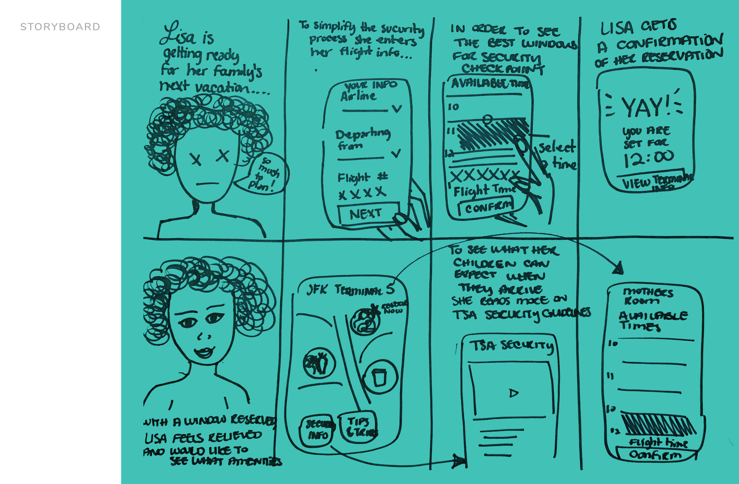
Storyboard, sketches and wireframes
Simple components and interactions
Clean forms, a simple and large reservation selection window and a home feed that features additional amenities are some key features explored in the sketches and wireframes.
The Solution

Providing families a security check-in reservation tool that gives them a breath of fresh air.


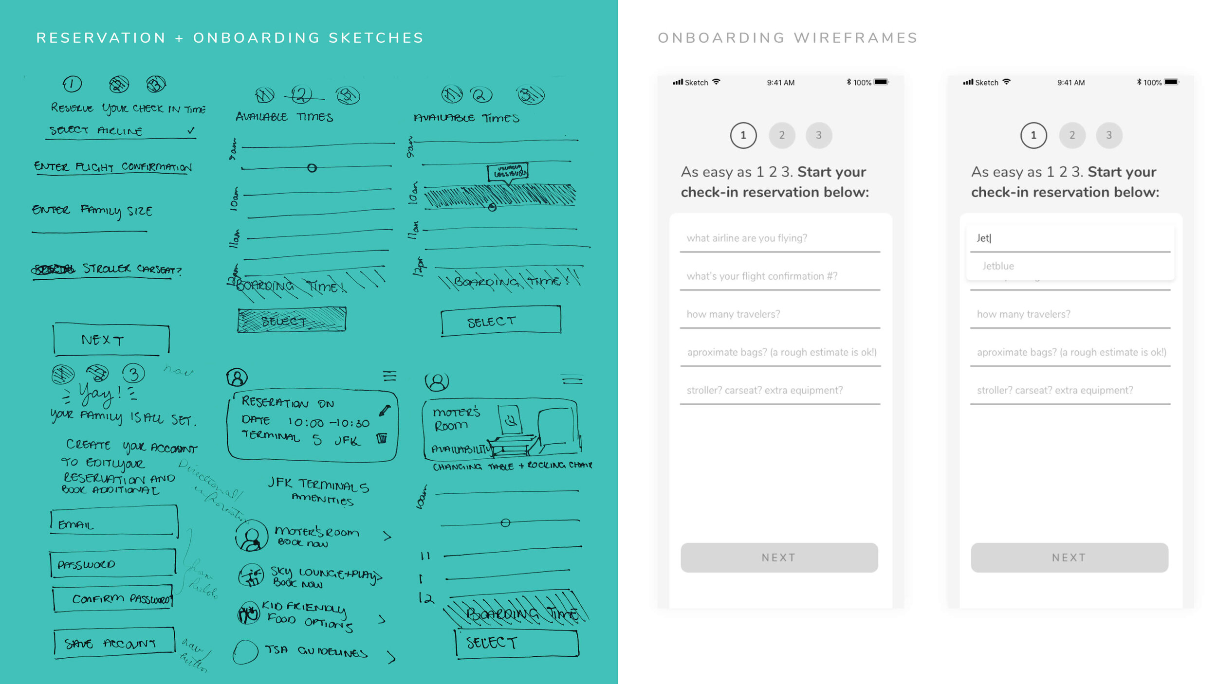
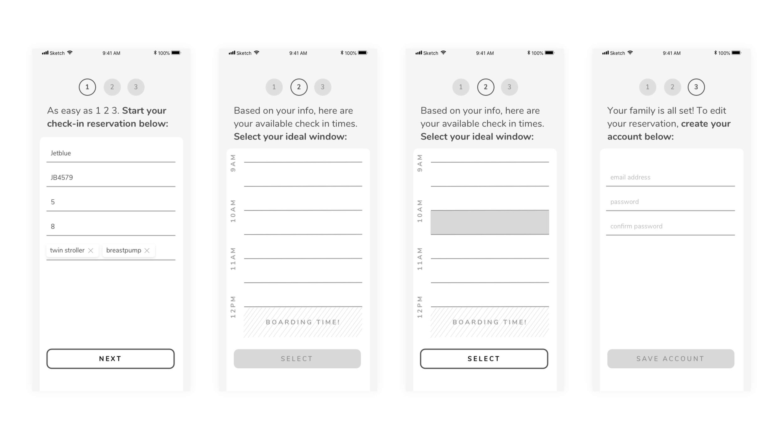
As easy as 1, 2, 3
On-boarding and reservation selection is quick and painless with simple forms that allow users to be specific about any additional luggage they may have.


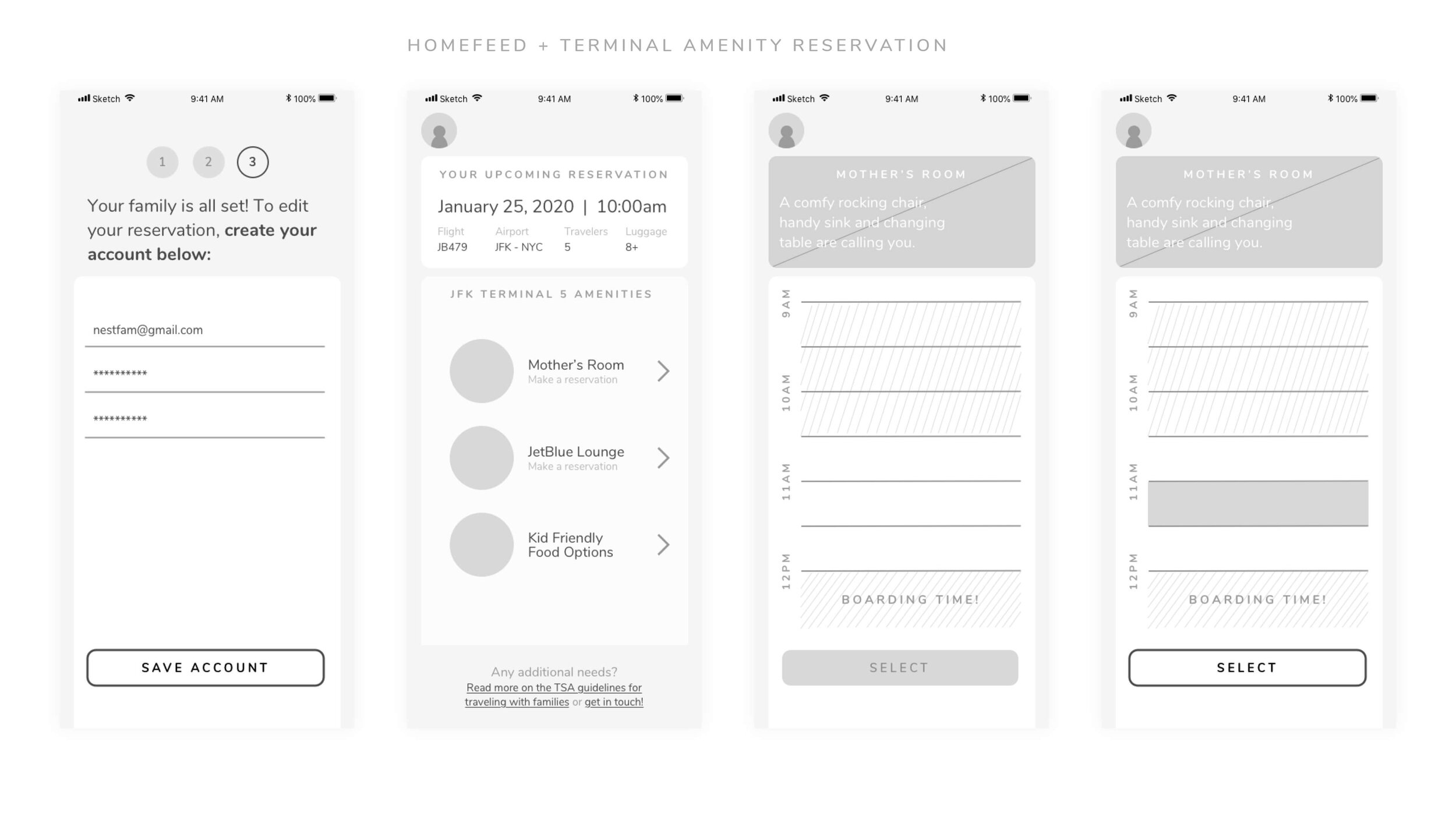
Terminal amenities at your fingertips
Explore terminal specific amenities available to you and your family. At a glance, users can see features and options for each amenity before making their decision to reserve.

Consistently simple
Once a user selects a specific amenity, they can see a photo and some additional information along with the reservation selection component, providing a cohesive experience throughout the app. Since the user has entered their flight confirmation number in the initial check-in reservation, their boarding time will be inactive in all terminal reservation screens to help ensure they arrive at their gate on time.

Family Friendly Features For Future flights
(Say that five times) Along with seeing all of the reservations on the home-feed, users can scroll to see featured content and partnerships highlighting family friendly initiatives at different airports, from sensory rooms for children with autism to airports with whole museums in them.
Usability Testing and Iterations
Design, testing, revising, repeat
Simplifying was the name of the game after a few iterations and usability testing. The feedback was overwhelmingly positive — parents were really excited to see something that would ease their travel experience. That said, there were some refinements and tweaks to make.

context before diving in
On-boarding is an important part of the solution. I wanted users to be able to get right into the task and worry about creating an account later. After some usability testing it was clear users needed a little more context and guidance to get started.

Simpler Layout
When testing both of these layouts for the same content users felt the right was more legible. The new layout also provided the opportunity to show more detail on reservation components in a clear way, giving the user more information before they decide to commit to tapping the reserve button.

An action packed nav
Users all agreed accessing chat should be prominent for a product that is all about service and access. Instead of having chat as a call to action at the end of the home feed, it earned a spot on the navigation.
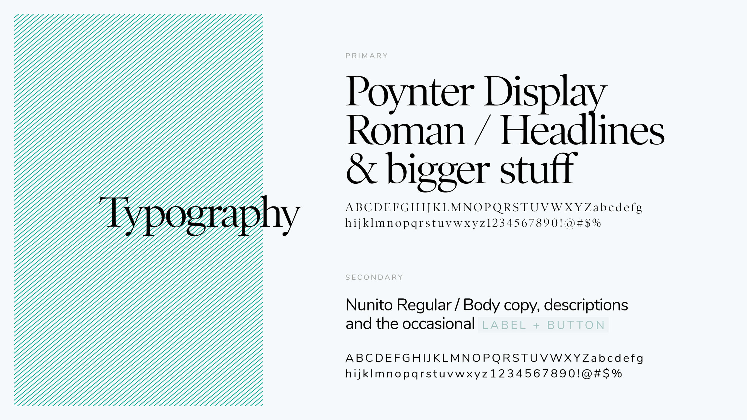
Defining The Brand Elements
The NestAir brand is bright, inviting and sophisticated, appealing to family members of all ages. The logo takes it’s cues from birds in flight, with a upward motion to inspire optimism.

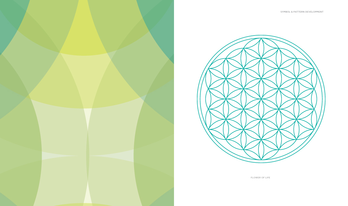
connectivity / geometry
The simple geometry of the Flower of Life and the Fruit of Life are core elements subtly incorporated throughout the brand, in the symbol and in the patterns. The Flower of Life is considered by some to be a symbol of sacred geometry, said to contain ancient, religious value depicting the fundamental forms of space and time. What’s more sacred than family? (Answer: A happy family on a full 8 hour flight.)


Every detail counts
As soon as families arrive to the terminal, they are greeted with bright colors and a casual setting with creative playgrounds for kids of all ages.
(Yes that means you too)

Brand Expansion and Vision
With a collaborative spirit and key customer insights, NestAir has the potential to grow from a security and terminal reservation service, to a full on family focused airline, ensuring the changing needs of all families are met and exceeded with care.


There’s more where that came from!
For additional UX/UI design samples, please reach out and I can share a link and password. All work shared is super top secret.